An artisan rebrand, botanical packaging, and sweet materials
Working together since 2025
Expanded sales to local shops including Casting Whimsy, Food Shed Co-Op, Algonquin General Store, and Olive Tap
Logo & branding goals
Rustic, elegant, colorful, natural
Inspired by botanical illustration watercolors
Incorporate bees and native wildflowers
Ready to sell in stores and farmer’s markets
How we delivered (and continue to)
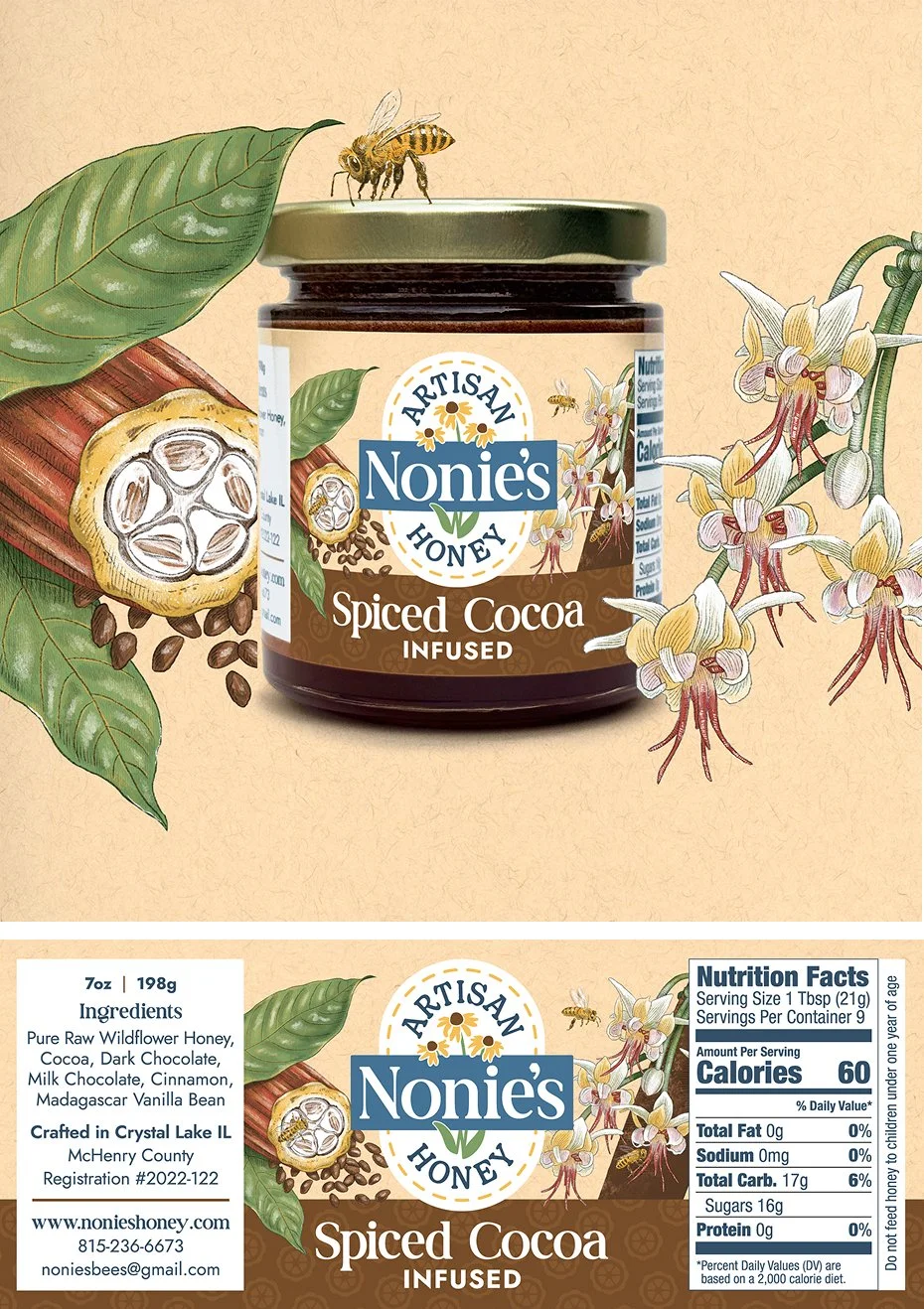
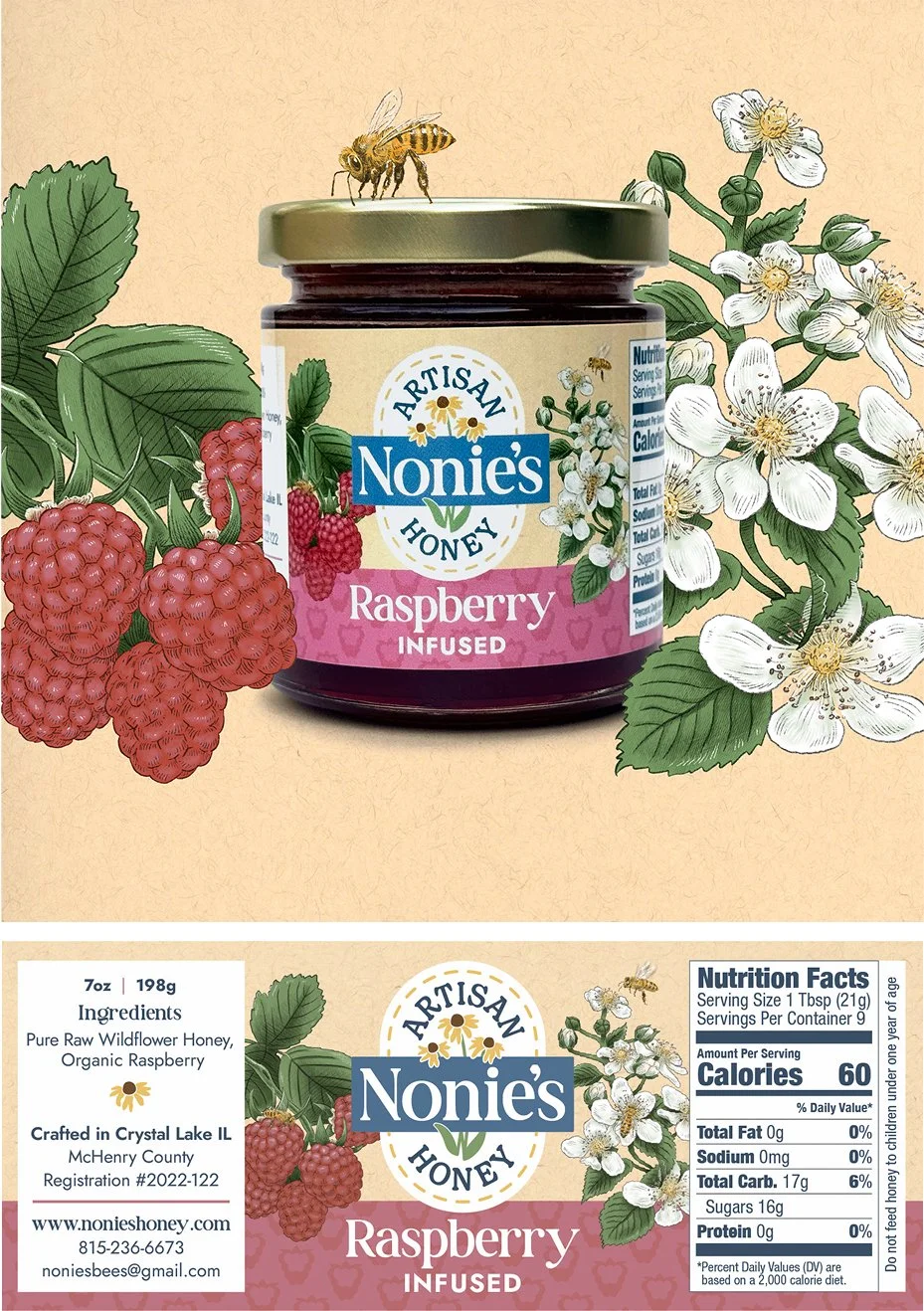
Create an elegant yet rustic brand
Paired contrasting modern sharp and friendly rounded fonts, and “imperfect” flower illustration.
Natural and prairie-inspired color palette with rich blues.
Delicate bee and botanical illustrations give a quality handmade look.
Incorporate bees and native wildflowers
Researched local honey bee and prairie flower species, selected for good color variation and representation. Used a consistent color palette for non-native flavor botanicals to create cohesion.
Illustrations are drawn separately and digitally using Procreate, allowing for flexible layering and consistent use across different materials.
Ready to sell in stores and farmer’s markets
Incorporated up-to-date nutrition fact and relevant food labeling requirements.
Flavor names are large and clear with unique color coding and illustrations, to make picking the desired flavor up off a shelf easy.
Compared designs to existing honey packaging to create something elevated.


Brand Concepts


“I can’t believe this is my brand. It’s so beautiful, exactly what I was envisioning, and everyone loves it!”
Noel Ilkow, Owner of Nonie’s Artisan Honey
Check out some other happy clients